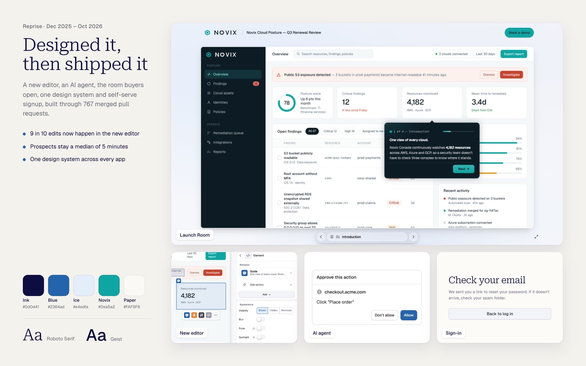
Designing an AI-first demo platform at Reprise
This year Reprise remade itself as an AI-first demo platform for enterprise. It opened a free trial for the first time in three years, put an agent beside the work, and moved every customer to a new editor. I designed how customers meet all three.
- Type
- Product Design
- My Role
- Principal Designer
- Year
- Dec 2025 - Oct 2026
Leadership set the goal in April: become the most powerful AI-first demo platform for enterprise. I worked directly with the founders and R&D to turn that into what customers use, and what their buyers see.
Engineers built the agent's abilities, the editor's engine, the AI Tour Guide and the connector for outside agents. I designed how people meet them.
THE RESULTS
What changed for Reprise
- New deals with a trial signup
- 1 in 5
- Edits in the new editor
- 100%
- Frustrated clicks per action
- 3.4× fewer
- Median prospect visit
- 5 minutes
Usage numbers cover customers only, from the product's own analytics. The deals number comes from the sales pipeline, since July.
THE FREE TRIAL
Prospects can try Reprise on their own, and sales meets warmer leads
 42% of trial accounts built a demo
- Why it mattered. Reprise had sold only through sales calls since closing self-serve in 2023. A prospect who has already built a demo is a better conversation for sales.
- What I did. With a teammate, I co-designed the path from the website to a first demo with no one from sales involved: a short form, a note from the founder, a one-click sign-in email, a three-step checklist and two starting points in the extension.
- The hard part. Nobody could see what people did. I set up about 30 usage events across the web app, the extension and the Launch Room, with signup emails scrubbed before they could be stored. They showed that a button every new user needed had been failing since late July. After the fix it fails about 1 time in 100.
THE AGENT
An agent beside the work, not a chatbot in front of it
Customers now build in one extension
- Why it mattered. Building a tour meant separate extensions and clicking Capture, waiting and confirming on every screen, 30 to 50 times.
- What I did. I folded the builders into one side panel: capture as you click, then edit by asking the agent.
- The hard part. An agent that clicks and types in a customer's own app has to ask before it spends money or touches a password, and it can't draw anything on their site. I designed for both.
- The result. More than half of the people using the extension have started a screen capture, and customers now connect their own AI agents to Reprise.
The same agent panel in the web app, the Chrome extension, the Flow editor and the Tour editor.
THE NEW EDITOR
One Inspector holds every tool
The classic editor retired for every customer on Oct 21
- Why it mattered. Enterprise sales engineers build their Product Tours here. Tools floated in panels that lost your work when you clicked away, and Find & Replace changed only the first match, so a prospect's tour could still show the previous company's name.
- What I did. I redesigned the editor around one Inspector: click an element and see everything it does in one place.
- The hard part. Moving enterprise customers without breaking their tours: a staff beta, both editors side by side, a way back to the classic one, and a 110-capability parity audit. When nearly every customer company had tried the new editor, I made the case to retire the classic one, and leadership agreed the same day.
Before, on top: tools floated over the canvas. After, below: one Inspector beside it.
THE LAUNCH ROOM
The seller decides once, and the buyer never has to choose
55% of new share links open in the new room
- Why it mattered. When a seller sends a demo, the prospect opens it alone, often in front of a buying committee. The room was the third-busiest screen in the product, and it didn't look like the seller.
- What I did. I redesigned it in the seller's brand, around an AI Tour Guide a teammate built, and cut the seller's path from a finished tour to a sendable link down to one click.
- The hard part. Every company's brand is different. The room has to hold up on a near-black, a neon or a pale backdrop, stay readable (WCAG AA contrast), and still work on a 375-pixel phone.
The room in the seller's brand, with the guided tour, the Tour Guide and full screen.
THE DESIGN SYSTEM
Three UI kits became one
7,382 lines of legacy UI removed
- Why it mattered. Three kits drew the same button three ways, and some screens simply failed: login messages you couldn't see, and a credit meter that never turned red when an account went over its limit.
- What I did. I moved every surface onto one design system, then wrote its quality bar as rules the team's AI reviewer checks on every pull request.
- What went wrong. Removing the old kit broke one large customer's custom plugin icons. The fix shipped 7 days later.
HOW I WORK
Informed bets, shipped small, changed when customers taught us
- Customers set the order. Requests decided what came next. Data cut what nobody used, like the Hide guides button, and we brought back what they missed, like the canvas menu, two days after removing it.
- Taste, written down. Quality, copy and naming rules live in the code, and a separate AI reviewer checks every change against them before a person does.
- Small and reversible. A median change is 223 lines, so any one can be undone on its own.
- No handoff. I design in the product, AI coding agents write the code, and I own how it behaves. The whole team works this way now: R&D merges about 27 times more changes than it did in December, and I shipped 767 of them.