Designing the future of workplace at Robin
I joined Robin as the second designer and grew into leading its design team. Here's a glimpse into some of the projects I led.
Steering Robin's product vision to meet COVID market demands
- Type
- Product Vision
- My Role
- Design Lead
- Year
- 2021-2022
Hybrid work models turned the status quo on its head, creating new norms where flexibility wins, but coordination is the new challenge. Robin’s product was built for the predictable work week we all know before COVID.
Customers were looking for solutions to help employees return to the office, understand colleagues' schedules, and stay up-to-date with office events.
Clear market demands and strong leadership facilitated the company's successful pivot.
- As the most senior member of our product organization then, I stepped into a leadership role during a period without a VP of Product. I worked closely with executives and co-founders, gathering feedback and ensuring alignment.
- The vision was presented to executives and shared with the company during a town hall.
- Vision work directly influenced product strategy, manifesting into a roadmap for product delivery.
Successfully built engagement loops and hit MAU goals
- MAU grew by 18% and established the platform's first engagement loops by introducing experiences in Slack and MS Teams.
- Transitioned Robin from a single to a multi-product offering—before COVID, only 15% of customers used desk products.
This vision supported the company in pivoting during an unknown time of COVID for many tech companies.
Automating the future of workplace software – shaping AI vision
- Type
- Product Vision
- My Role
- Design Lead
- Year
- 2023
- Peers
- Product Marketing Manager
I led this vision project to show what an AI-driven workplace experience may look like. I worked with a few peers on Marketing to create the storyline and launch this effort.
Managing enterprise workplaces involves complex, time-consuming tasks that often overwhelm office managers and facilities teams. From organizing workspaces to booking resources, the sheer volume of manual operations can lead to inefficiencies and a lack of optimization. Without the right tools, these teams struggle to predict utilization and automate daily operations.
We saw this as an opportunity for a transformative change. My approach identified core parts of the customer journey and the end-user experiences to understand where automation and AI flows can provide the most value.
We focused on automating the mundane yet essential tasks (booking desks and meeting rooms). This wasn’t just about simplifying tasks; it was about redefining the operational dynamics of workplaces. Read more about this future on the Robin blog.
Boosting NPS in a shift to user-based pricing
- Type
- Company Initiative
- My Role
- Project Lead
- Year
- 2023
 Achieved company NPS goal
After returning to offices post-COVID, Robin's NPS dropped, signaling a need to refocus on core features originally paused during the pandemic. This shift exposed a gap between user expectations and our product offerings, leading to a drop in NPS from 40 to 15. We set and achieved a goal to improve NPS.
I started to analyze NPS feedback, tagging it (with emojis, made it fun 🙉) based on categories and talking to users to fill in the gaps.
Simultaneously, our shift to per-user pricing was added motivation to dial in the UX—per-user pricing meant a need for frequent product use.
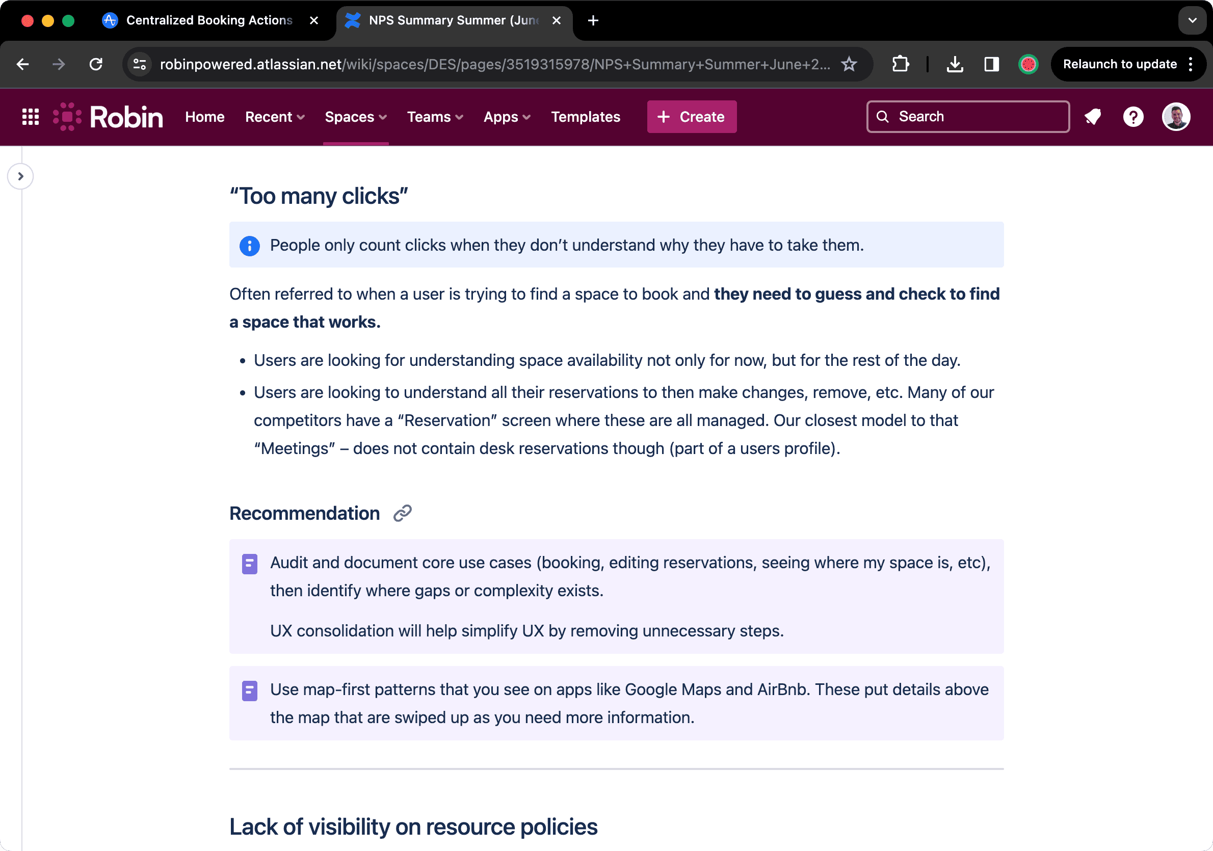
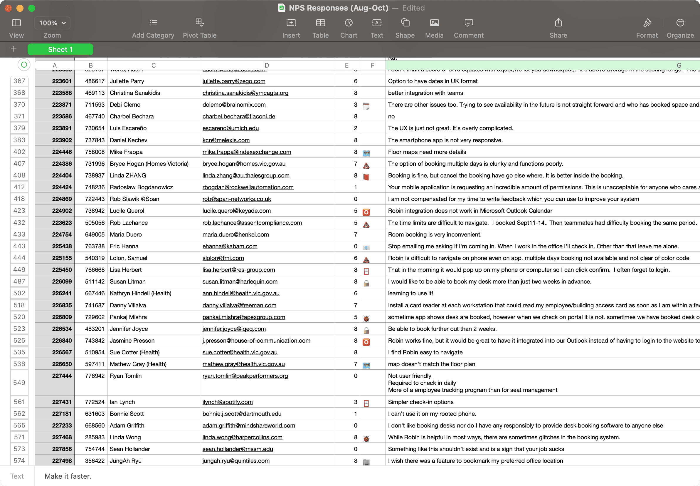
A few documents were used to communicate findings and recommendations from Design.
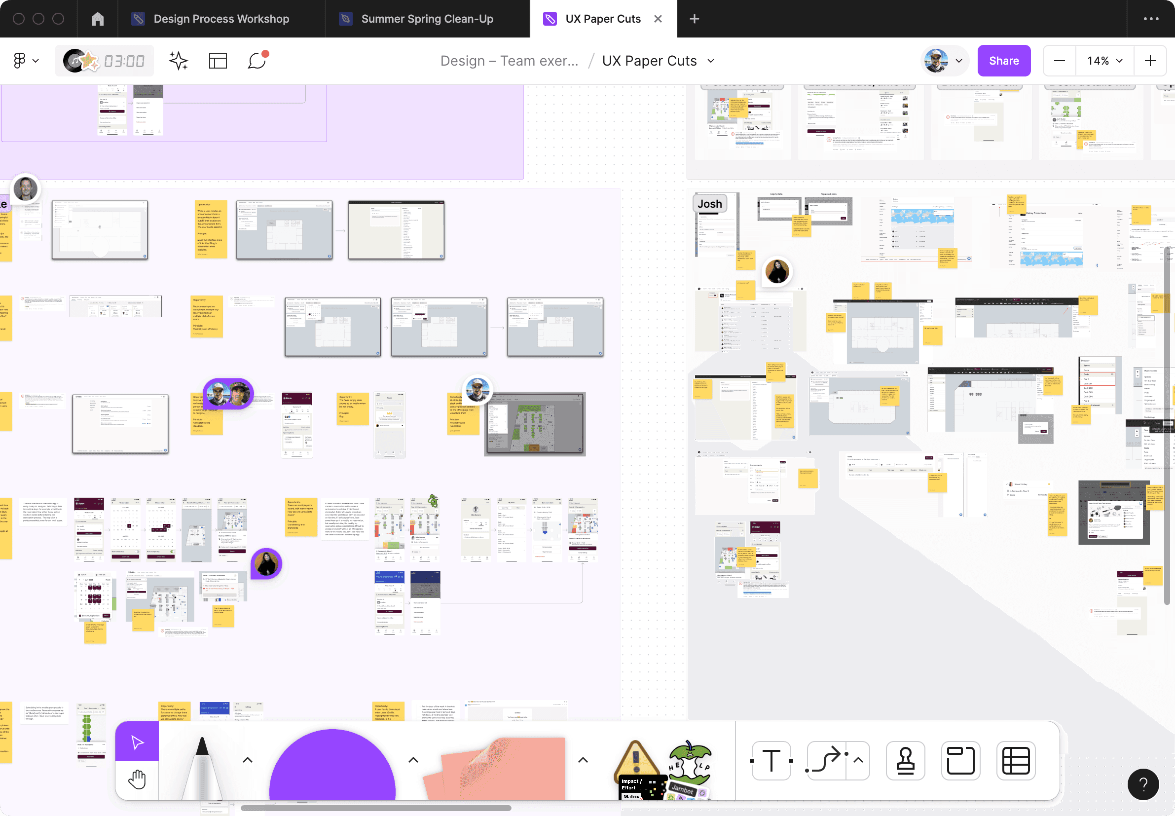
Design team audited the UX to identify impactful areas
Our design team conducted a platform UX audit, identifying opportunities to improve the UX. We uncovered many problems and couldn't get to all of them for this NPS sprint.
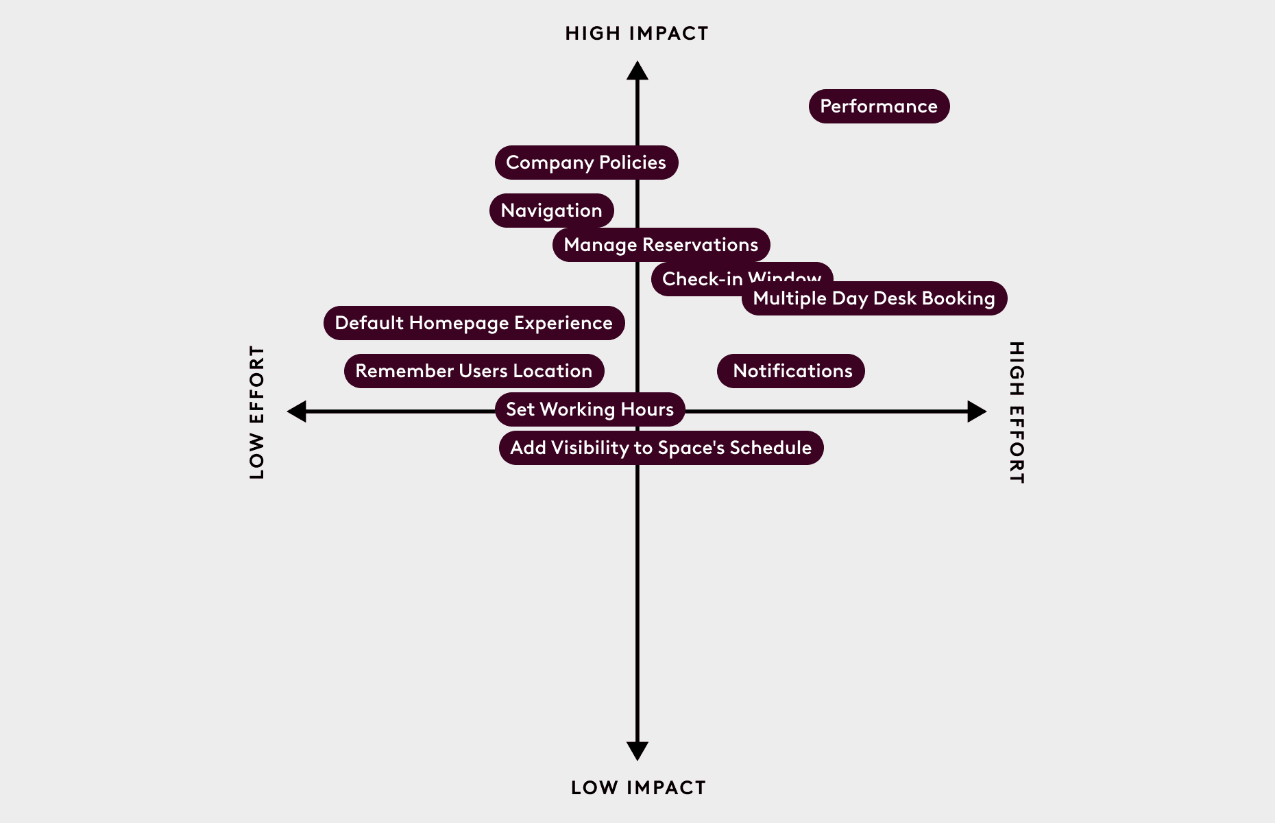
Before sharing with executives, I prioritized solutions, mapping them on a matrix (helpful format to communicate to execs) and providing added context to each problem.
Solution Highlight: Add a global booking action increased booking conversions by 47%
During this initiative, my role involved multiple solution designs, with one standout contribution being the implementation of a global booking button within the mobile app.
This feature is seamlessly integrated with the established mobile UI and user flows. The primary enhancements were the accessible booking button and its accompanying fly-out menu. A reminder that significant product enhancements do not always require massive overhauls.
The primary goal was to provide users with a straightforward and reliable method to reserve resources. Ensuring users could effortlessly book what they needed when needed was essential to improving their experience.
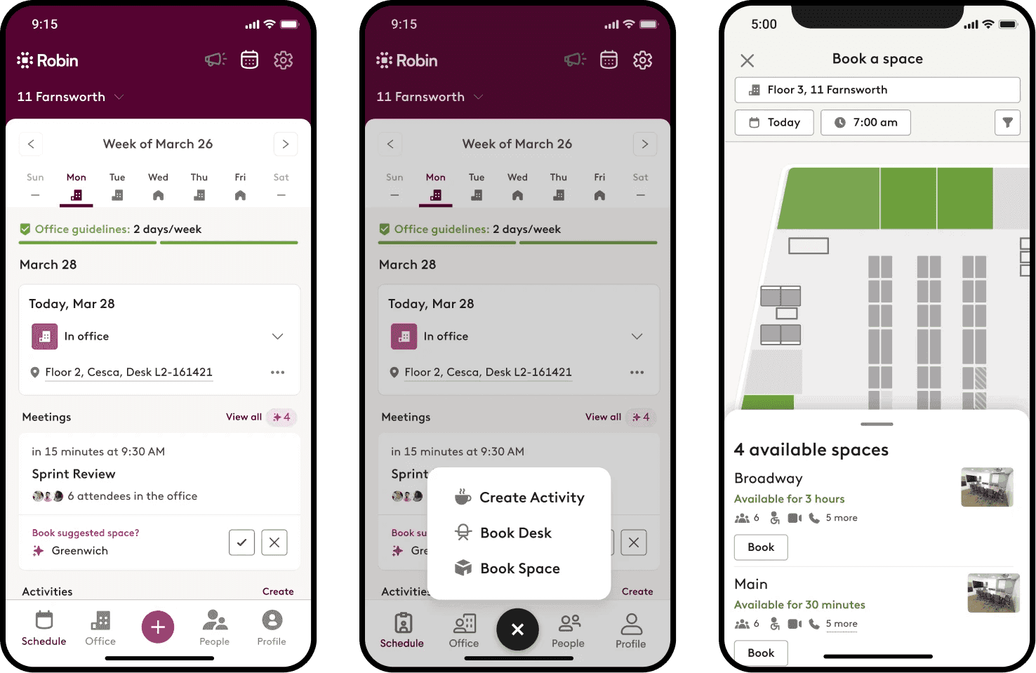
This iteration, added a centralized booking menu to mobile, giving users a predictable way to book resources.
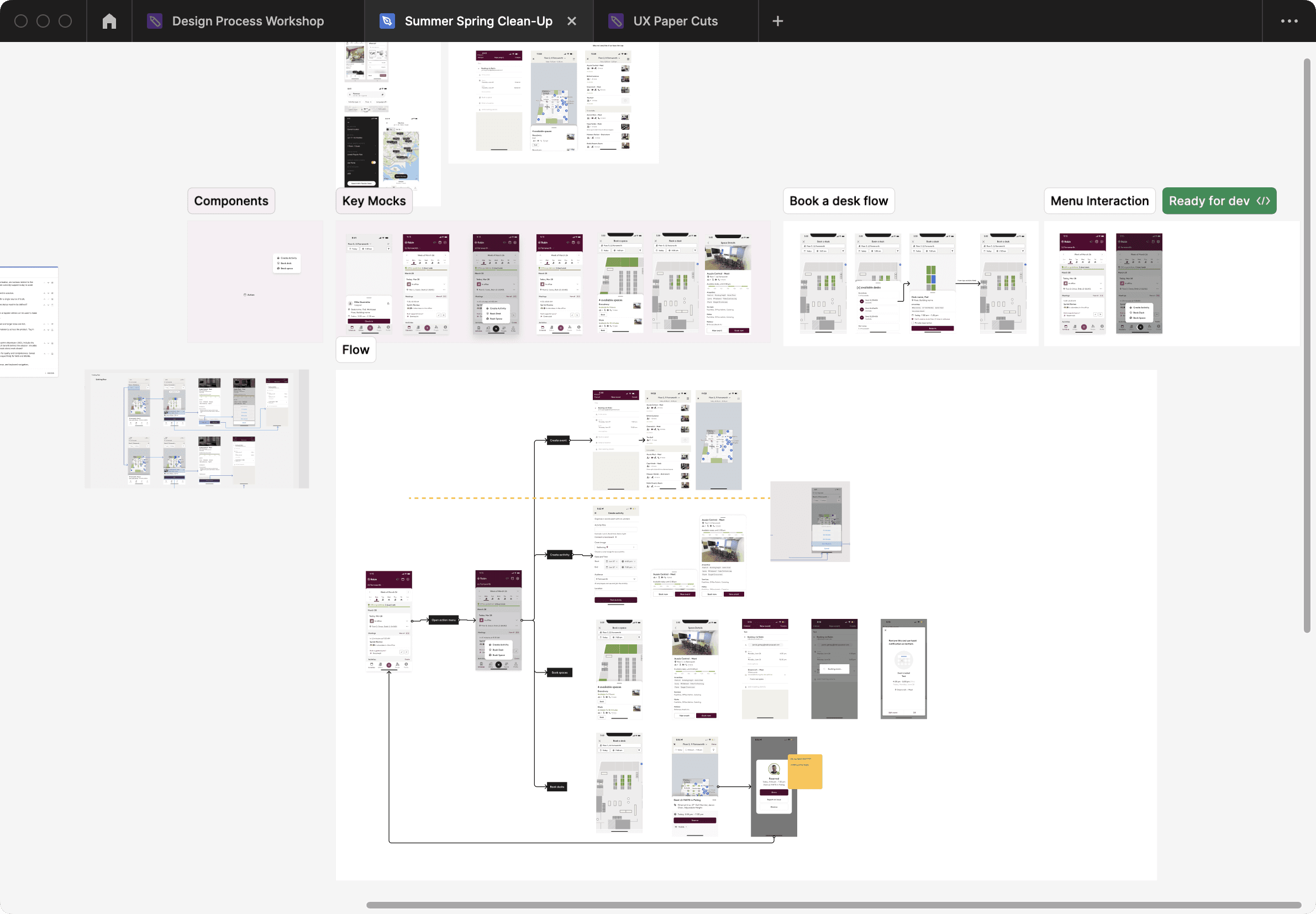
Figma file to show the many parts of this solution and how I utilized existing parts of the product to solve this.
Delivered over 75 tickets with R&D
Fixes included anything from making the UX easier to use, fixing bugs, doing what customers requested (which also happened to be gaps in core needs), and making the app more performant.
What made us really proud was how we all worked together. We all focused on making things better for our customers.
This shows how even small things can have a big impact.
Scaling the Design organization
As the Design team grew, so did our process and operations. I worked with the Design to improve this across several iterations as we learned what best supported the team and delivery quality.
Areas we needed to focus on improving:
- Design quality slipped—patterns requiring consistency across platforms were solved in different ways.
- At times, there were gaps in our understanding of the customer's needs, leading to misaligned problems and solutions.
- Team wanted to know what career development looked like.
- Managers and I could improve communication and expectations for better autonomy and quality work.
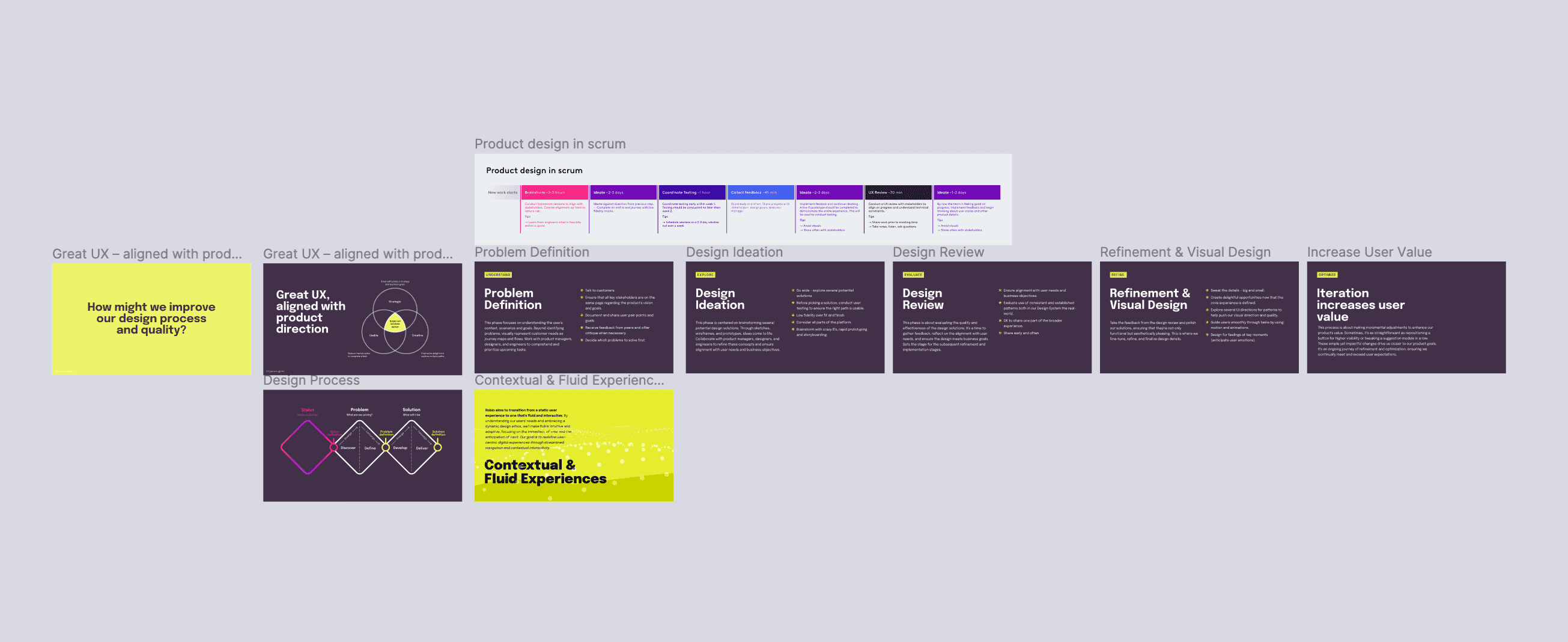
Clarifying the design process
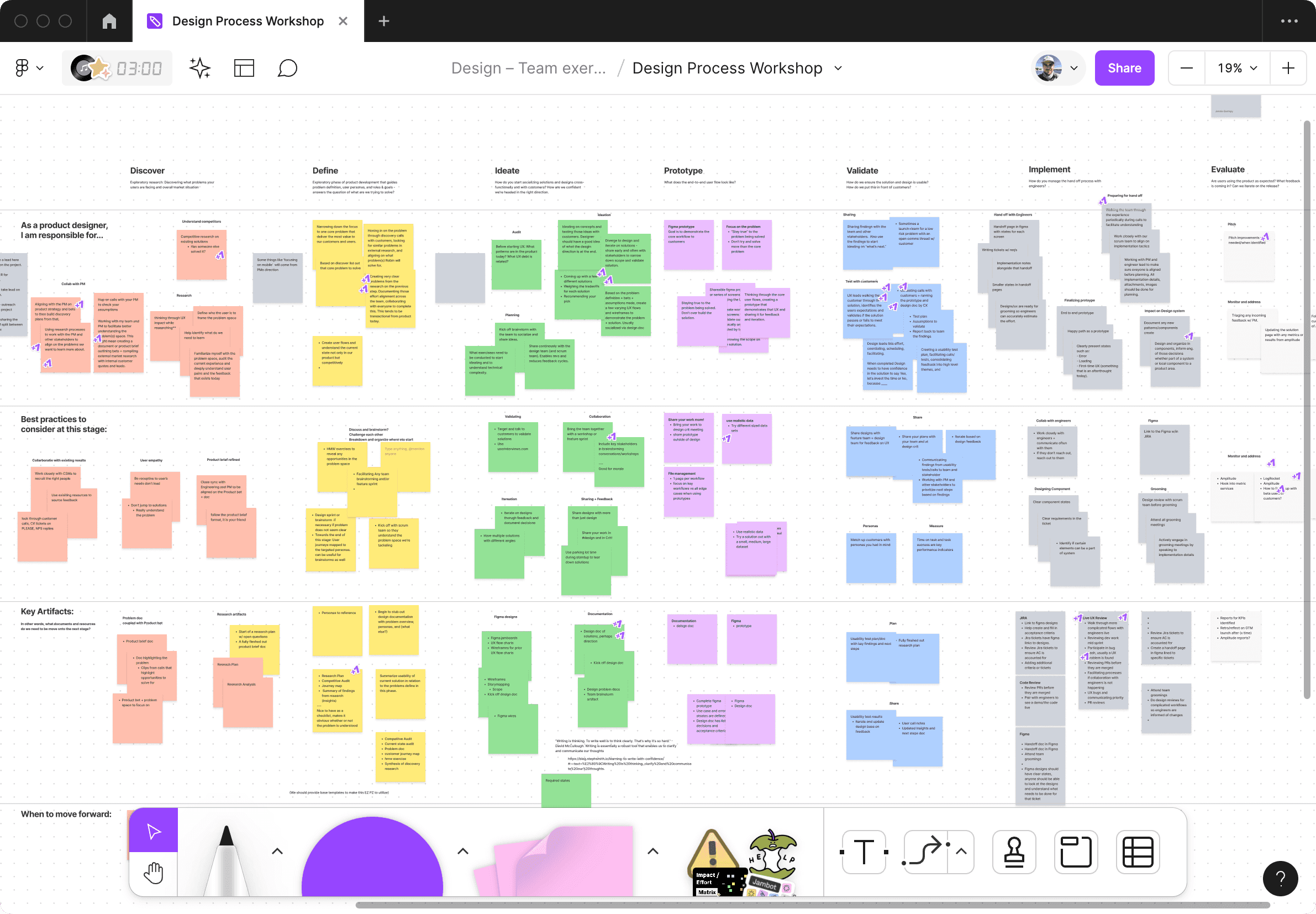
Across several workshops, we worked together, laying out the current process and areas to improve. This workshop focused on when to loop in execs for reviews and accessibility standards.
As a result, the team opened up and shared candid feedback, which helped us resolve root problems. The team was able to get a clear picture of what was expected throughout the process to deliver their best work.
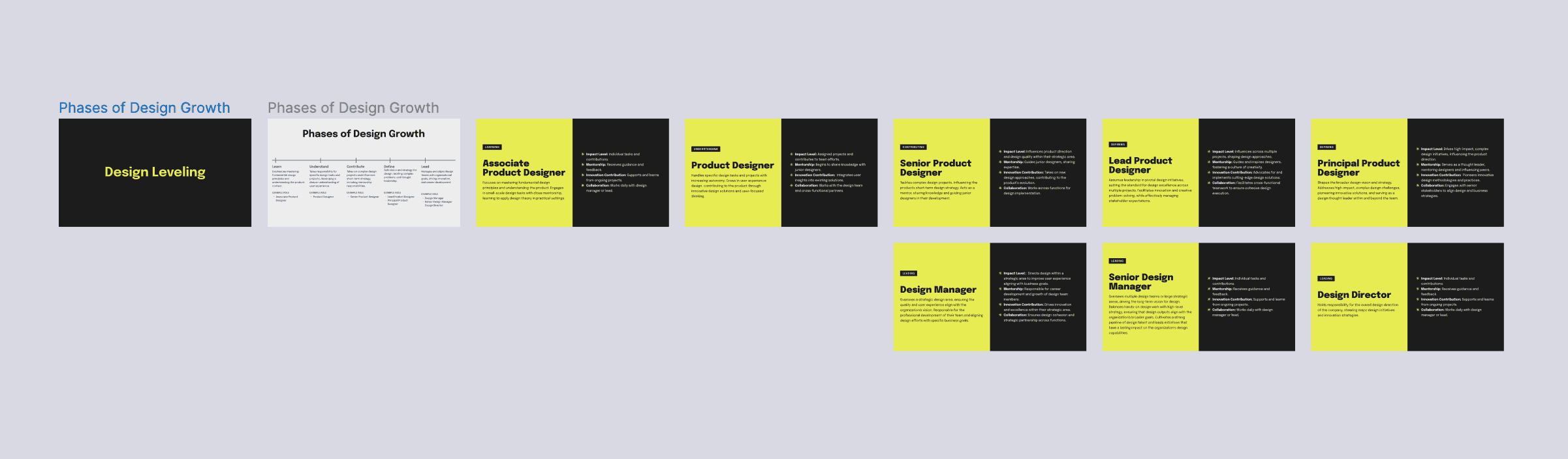
Creating product design career leveling
Leveling is typically an enigma and shouldn't be; designers should know exactly what's expected from their current role and the steps to take to advance their careers.
Goal: Lay out career growth for designers at Robin as clearly as possible.
The People team developed the leveling framework used, and I defined each level, mapping each role to the framework.
One challenge I kept facing was balancing the level of detail for each level. Too much detail and it becomes a checklist; too little, it's too vague. A few designers on the team were looped in for gut checks and feedback to help strike the right level of detail.
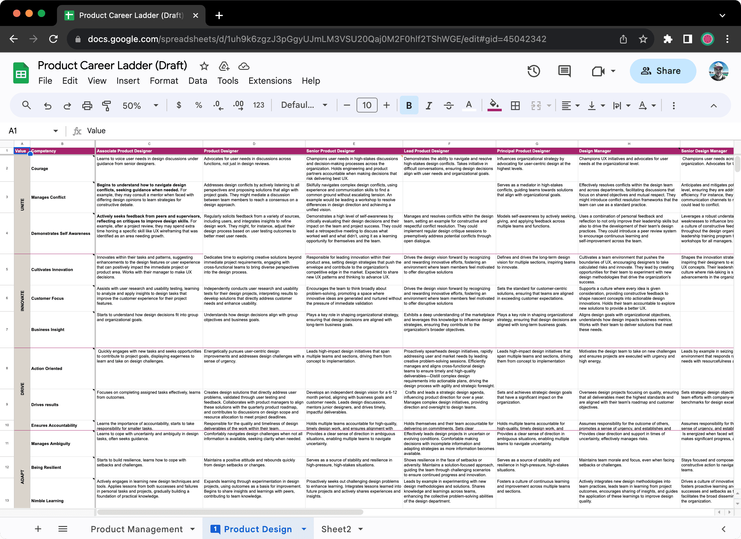
Introducing new leveling as a spreadsheet is tedious. I designed these "role cards" to introduce leveling to the team. These cards summarize the role, while the spreadsheet can be used on 1-on-1s to facilitate performance discussions.